This experiment will be fabric pounding with Jacquard Sherrill's Sorbets. I think I can easily use up the eight small bottles I inherited. These are discontinued, but considering they are pastel colored, I don't think I am going to want to buy replacements anyway. In addition to these, I am also adding some metallic paints. The fabric pounding tutorials I looked at included a metallic and I liked their results.
I am using these two blog posts for my "how to" reference.
- And then we set it on fire...: http://andthenwesetitonfire.blogspot.com/2014/04/pounded-fabric-process_29.html
- Wil's art: http://wilopiooguta.blogspot.nl/2014/04/pounded-fabric.html
Here are the fabrics I used. One is a commercial fabric I over-dyed blue. It was in my discard pile so it is no problem if it still looked horrible in the end. I also used an ice-dyed fabric, and this dark magenta(?) fabric. The magenta fabric is one I dyed, but do not remember when or how. I am sure it's in the blog somewhere. It may be polyester dyed with purple I-dye?
 |
| My pink Lumiere was dried up, so didn't get used on the purple fabric |
I soaked my fabrics in water, and wrung them out so they were still damp/wet, but not dripping. I put my paints in a plastic container, put my cheap paint brush (1" wall painting type brush) in the paint, and then use the brush to smush/pound the paint into the fabric, each fabric in it's own plastic grocery bag.
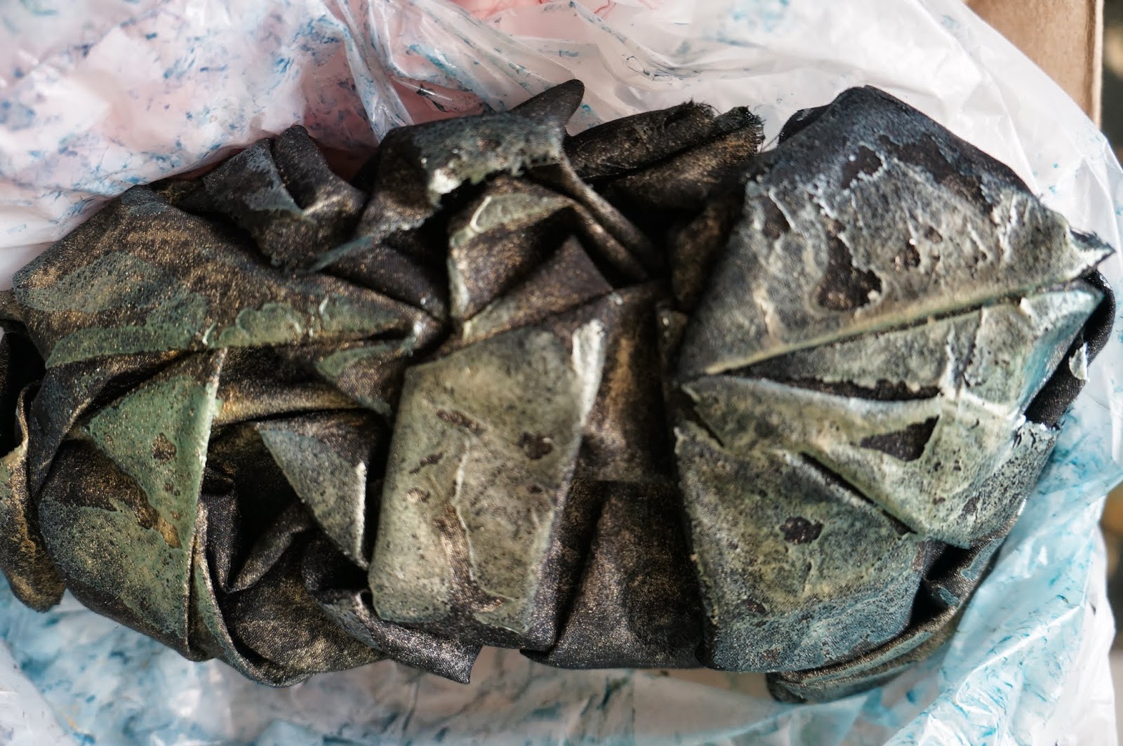
I also grabbed some black fabric. I did run out of the Sorbet paint before the last piece of black fabric, and I used Lumiere paints as well as gold and silver metallic craft paints on this last piece. When I was pounding the paint on, the colors looked like peacock feathers, so took a picture of it wet.
The "how to" blog posts I referenced made it sound like I should let the fabrics dry slowly indoors, so I left them in plastic grocery bags for two weeks. I had them tied closed the first couple days, then untied them and rolled the plastic down a little bit for the rest of the time.
Here are my results:
The top one is my "peacock fabric". This is the underside where a lot of the pigments pooled, then dried.
Closeup
Purple fabric after drying.
After ironing. You can see more of the pastel paints on this one.
The paint is barely visible on this ice-dyed fabric, just some gold metallic is visible.
The blue commercial fabric with circles. It looks like a lot of the paint pooled to the bottom. Maybe my fabric was too wet. Regardless, it looks horrible and it went into the trash after these photos were taken.
After ironing.
This one turned out nice, although it looks like I just used white paint.
Closeup.
When I opened these up, before ironing, I was not impressed at all. The pastel colors seemed to convert to white and they just looked sad. The metallic one up top seemed interesting, but had lost so much of its' Lumiere peacock color. After ironing, I definitely like the ones on black fabric.
All in all, I don't think I will repeat this technique, the results are too unpredictable (and I do typically think unpredictable can be fun, but in this case, not so much). Also, I am impatient and don't want to wait two weeks for my fabric to dry. I do think this technique is better with metallic paints on dark fabric, the pastel paints were pretty ineffective and either were unnoticeable, or looked white. That said, I did like the Mint and Tangerine paint colors straight out of the bottle. Not that it matters since these paints are discontinued.


I haven't heard of this technique but I love the effects! Will definitely be playing with this...
ReplyDeleteI hadn't heard of it either until I saw it on the blog "...and then we set it on fire". I like how the paint design looks like facets or fractures.
ReplyDelete